The Logo and Branding Bar
The Logo and Branding Bar work together to strengthen the IGP Specialty brand.
Note: The integrity of the IGP Specialty brand depends on the proper use of several elements besides the Logo and Branding Bar. See Additional Guidelines.
▶ Jump down to The Branding Bar.
The Logo
Two versions of the logo are available: Logo A and Logo B. The logo is to be used full-color (blue and orange) at all times.
The logo should appear on a plain white background, free of any other elements, using the proper clear space.
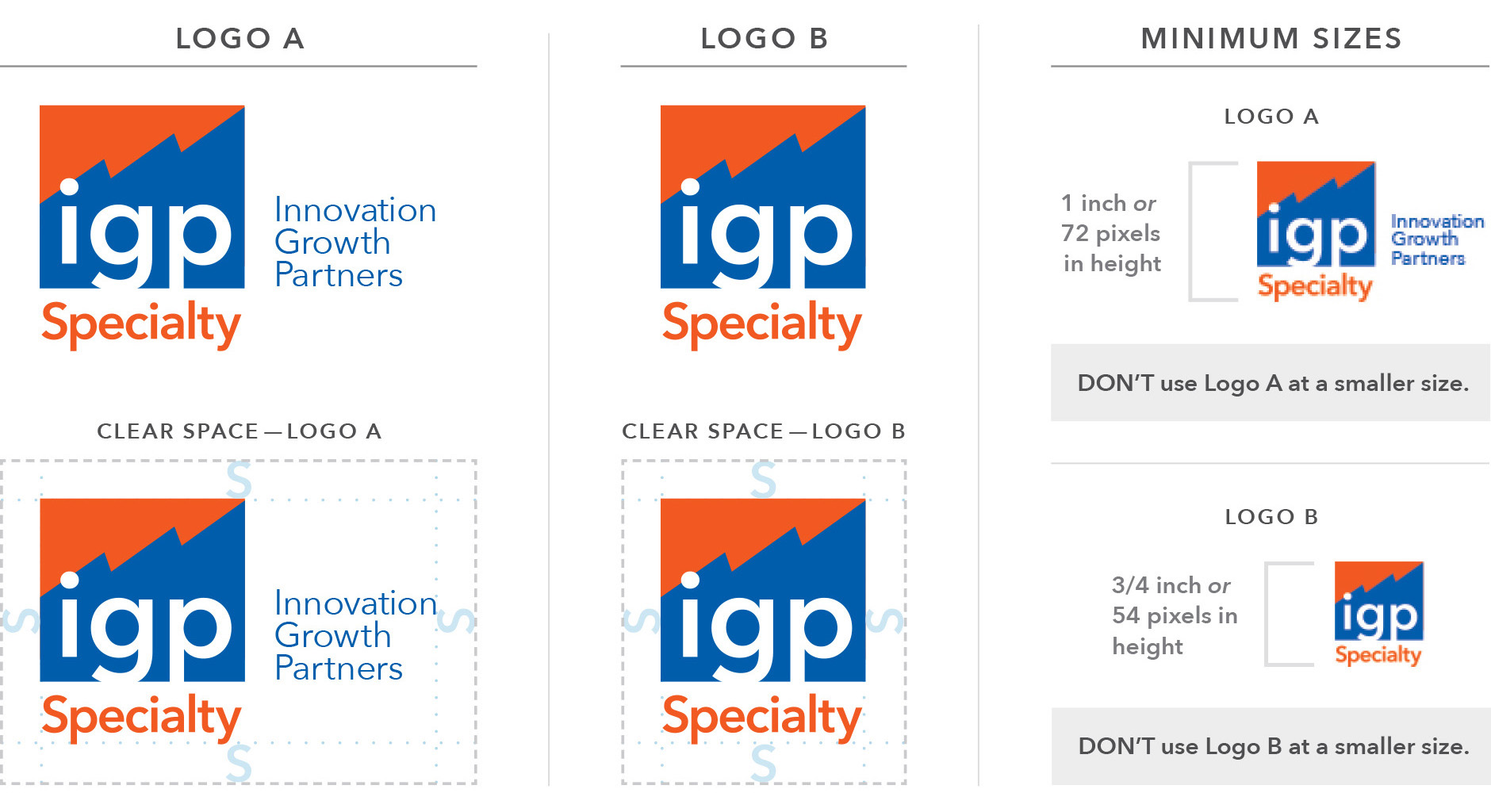
Clear Space: When using the logo, a minimum clear space must be used. This space is equal to the height of the S in the logo.
No other elements should be close enough to the logo to imply they are part of the logo, or are a special logo.
Size Requirements: The logo should not be used under a minimum size, as shown above. Since Logo A includes the words “Innovation Growth Partners,” its minimum size is larger than Logo B to ensure it is readable.
What to Avoid: Black-and-white, one-color, and reversed-out printing are to be avoided unless no other option is available. If this is the case, contact the Programs & Wholesale marketing team for assistance.
When to Use Logos A and B: Logo A should appear at least once in multi-page documents such as presentation decks, white papers and brochures. In general, Logo A should be used on the first page, while Logo B should be used on successive pages when needed. See an example here.
Forms, applications, agreements and similar documents must use Logo A. See an example here.
Single-page marketing materials are not required to use Logo A, but Logo B must appear on the page, as in a footer, along with the words “Innovation Growth Partners Specialty, LLC” clearly visible on the page. Divisions with their own logos must also use Logo B. See examples here and here.
![]()
The Branding Bar
The Branding Bar is a simple, easy-to-implement design element used to easily identify IGP Specialty marketing materials. It should always appear on sales sheets, emails and presentation decks, along with the logo.
- The Branding Bar should always meet three edges of the page: top, left and right, or bottom, left and right (or both).
- Forms, applications, agreements and similar documents are not required to use the Branding Bar, since they are not sales materials.
- Giveaway items such as note pads and mugs are not required to use the Branding Bar, due to imprinting restrictions. See Additional Guidelines.
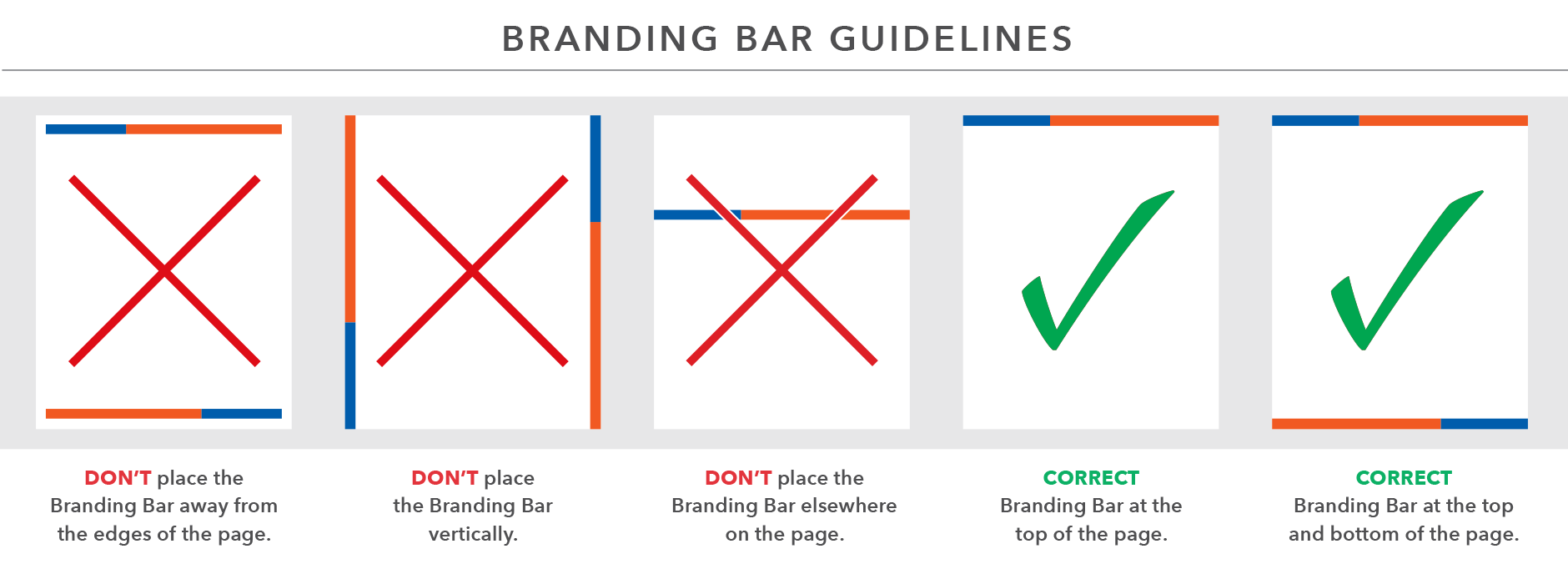
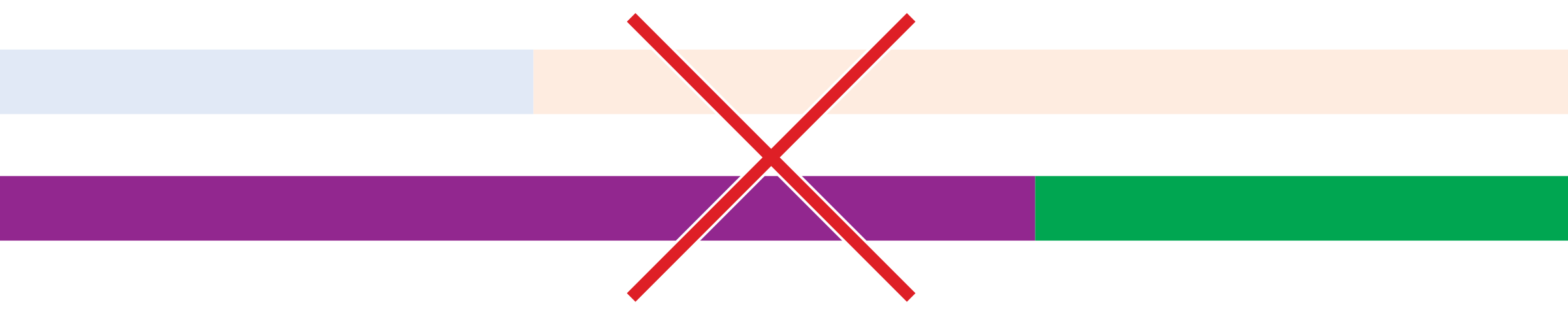
- The colors used in the Branding Bar are IGPS Orange and IGPS Blue. No tints or other colors should be used.
- The two colors should always be used as color blocks in a one-third to two-thirds ratio in width.
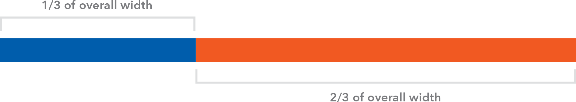
- The Branding Bar can be used with the 1/3 color block on either side. When used at the top and bottom of a page, such as a flyer, the bottom bar should be flipped horizontally relative to the top bar.

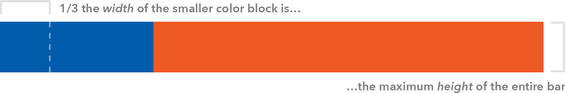
- Overall height is variable, but the height should never appear more than 1/3 the width of the smaller color block. Minimum height is 1/8” or 12 pixels.
TIP: To ensure your material follows our brand guidelines, reach out to your Marketing Point of Contact.
FOR INTERNAL USE ONLY
For best results, view in a browser on a desktop or laptop.
What does the logo represent?
The IGP Specialty logo represents our focus on client success with shapes suggesting:
- Growth Chart—Increasing Business
- Mountains—Reaching the Top
- Lightning—Prompt, Efficient Service
In addition, letters breaking the boundary of the box suggest:
- Thinking Outside the Box
Common Questions
Q: Do I really need to worry about all these guidelines?
A: Not if you go through the marketing department—we’ll ensure your material meets brand guidelines. But if you are creating your own material, such as a PowerPoint deck, yes.
Q: How do I request marketing support?
A: Download our Marketing Points of Contact PDF to get started.
Other Questions?
Contact Steve Beavers.